I thought it would be nice to give a little insight to how the new look logo came about. When I approached Ryn Frank to work on my branding I was asked to fill out a questionnaire so she could get an idea of what I wanted to achieve. It was an interesting process for me because I wasn't completely sure what I was looking for at that point. It meant that I could put down on paper what I hoped people felt when they saw the brand, and how I wanted the branding to reflect me as a person as well as my jewellery.
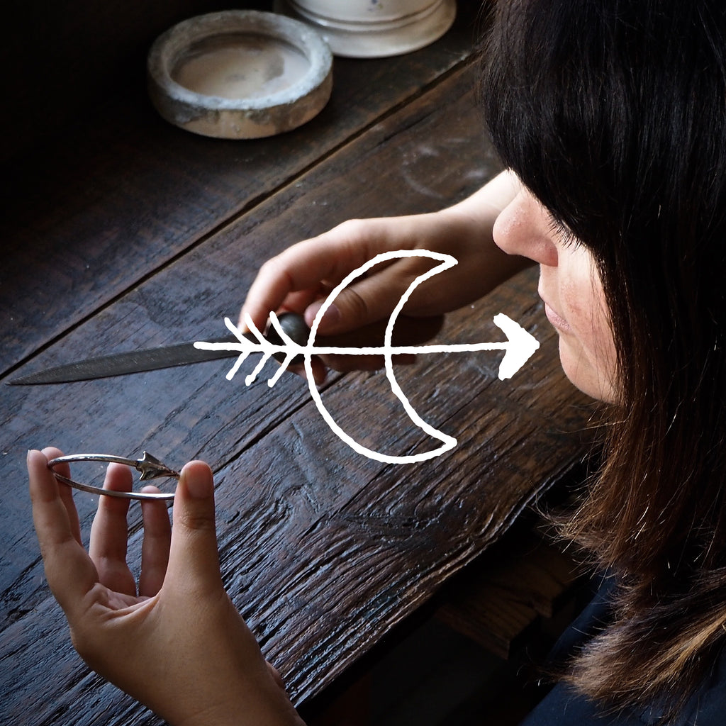
One theme that has always flown through my work is folklore and folk art, so when I was sent the original selection of logos I was instantly drawn to the style of the moon and arrow. It represents both me and my work perfectly. You see, the crescent moon is the alchemic symbol for silver, and although I do work with gold it is primarily silver that my jewellery is made in. The arrow that pierces through the moon not only represents my folklore theme, but also me as I have a small arrow tattooed on my wrist. It was like Ryn was in my head, sorting through all the muddles and finding what I couldn't, and I simply could not be happier with the result!
G x